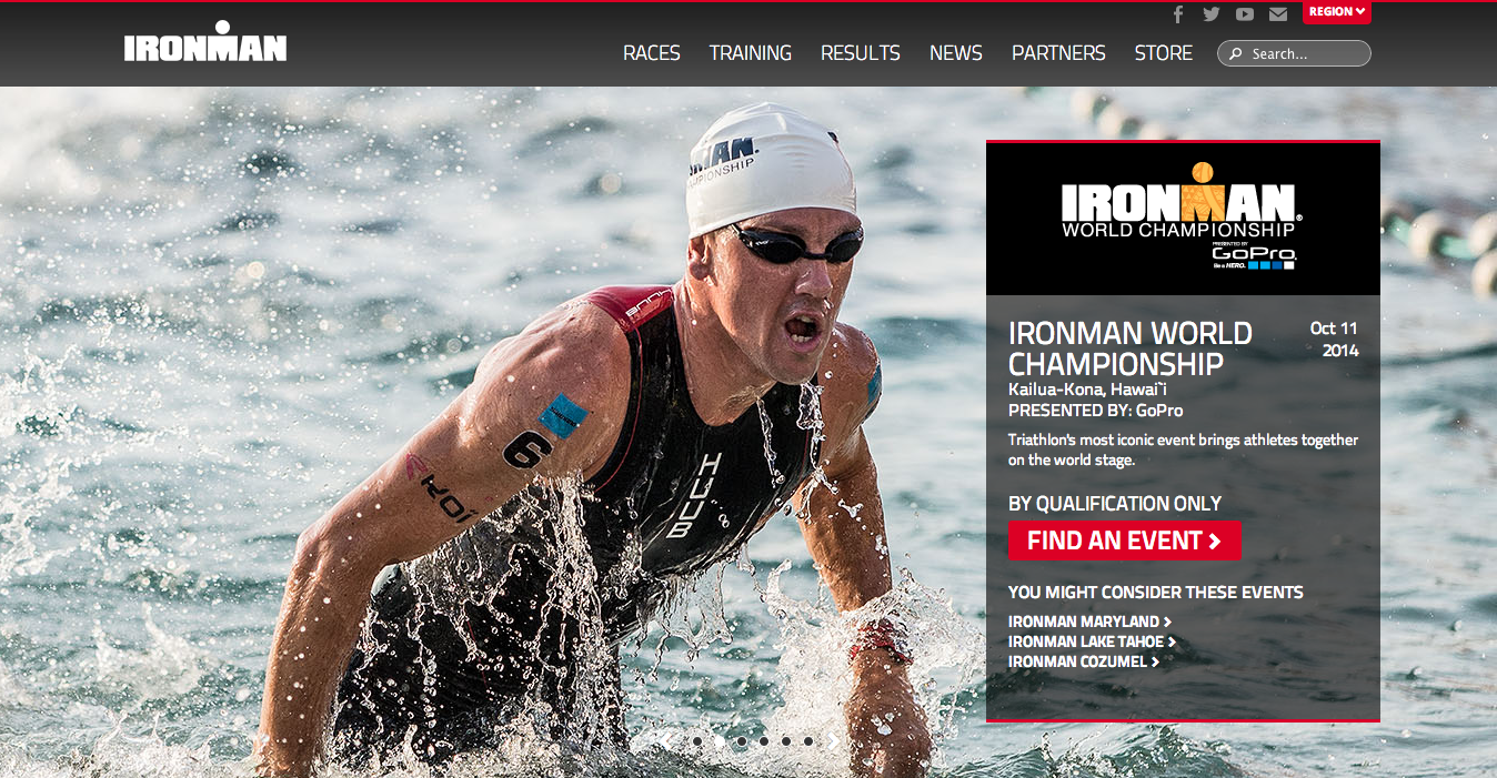
#Overlay Effects
##What is it?
A very popular design trend on the web in recent years has been various forms of overlay effects where text is overlaid on a large image or video background. A number of different techniques can be used to create contrast between the content and the graphics to achieve various effects. Historically, many of these effects have been applied directly to the images to give designers complete control of how their assets appear. However, as the web evolves, they have become easier to create using just web technologies.
Types of Overlay Effects
####Blurred Background A very popular way to get a nice contrast between content and visual media is simply to blur the background. This makes the focus point in the design explicit, drawing the eyes to the non-blurred part of areas of the page.

####Transparency Overlay Another widely used technique for overlaying content is to place it on a design element that is partially transparent. This is commonly done with shades of black, gray, or white to achieve the best contrast, but more vibrant colors can be used as well.

####Tinted Images Color can be used to set content apart from its background. You can effectively incorporate your design’s color palette by tinting an image with a single color and overlaying content in different colors that contrast well with the background.

####Gradient Fade
Applying a gradient that fades along the edges of an image adds an artistic effect that enhances contrast to content laid over it. As with transparency overlays, this is commonly done with shades of black, gray, or white.

####Frosted Glass
The frosted glass technique is a distinctive characteristic of some major native OS desktop and mobile platforms. It has also been replicated on the web and combines several of the techniques described above. To achieve the frosted glass effect on the web, you can combine blurring, tinting, and transparency to create a more dramatic contrast.
Recently, the frosted glass effect got a little easier with CSS Filters. Prior to CSS Filters, this was typically done with two versions of the same imagea blurred version and the original versionand with many other CSS properties to create the effect. Now, CSS Filters greatly simplifies that the process. Only one copy of the image is required. You then apply as many filter functions as you need for the desired effect. For an in-depth walkthrough of creating this effect both with and without CSS Filters, check out the CSS Tricks article Frosting Glass with CSS Filters. To learn about all of the other cool things you can do with CSS & Filters and the Adobe Web Platform team is doing in this area, check out our Filter Effects project page.

##What’s being done to make Overlay Effects better?
We’ve observed there are many different ways to achieve these effects. Also, a lot of effects are still achieved by editing images directly, rather than using CSS and HTML We wondered if this was an indicator that the web technologies were still not meeting the needs of designers who are concerned with design fidelity. We decided to spend some time researching this and interviewed many designers and developers to find out how they achieve these techniques and what challenges, if any, they face in creating them.
To our surprise, we found that people were generally content with the methods available to them for creating Overlay Effects. The people we spoke to either found no real challenges to achieve the desired effects or specifically avoided using some of them due to perceived overuse and trendiness. Read more about our research in this area on our blog: Lean Experiment: Overlay Effects.
If you have opinions or input on this topic, please let us know by taking a few minutes to complete our quick survey. If we gather more information to cause us to revisit this, we can then contact you to discuss your ideas further.
Where can I learn more?
There are some great tutorials on the web where you can learn how to create these effects in your designs.
Creating a Soft Blur Effect with CSS Filters
CSS Tricks: Text Blocks Over Image (Transparency Overlays)
Image Tint With CSS
CodePen: Background Image Gradient Overlay