#Drop Caps
##What is it?
A typographic pattern that predates printing, drop caps - also known as initial capitals - are letters at the beginning of the first word of a chapter or paragraph that is larger than the rest of the text. They are both decorative and used to highlight the beginning of a new section; for instance, at the beginning of a chapter, or a new part of a long-form article.
Drop caps remain very common in print - including magazines - but are relatively rare on the web. This is likely due to the difficulty of reliably aligning the initial letter with the adjoining text according to typographic convention. The drop cap’s baseline, for instance, must align with the baseline of one of the its paragraph’s lines. But the exact position of the latter is a function of which font family the browser uses at runtime.
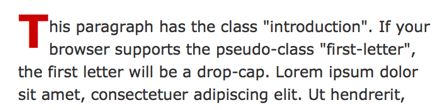
A typical CSS drop cap will look like this:
 </img>
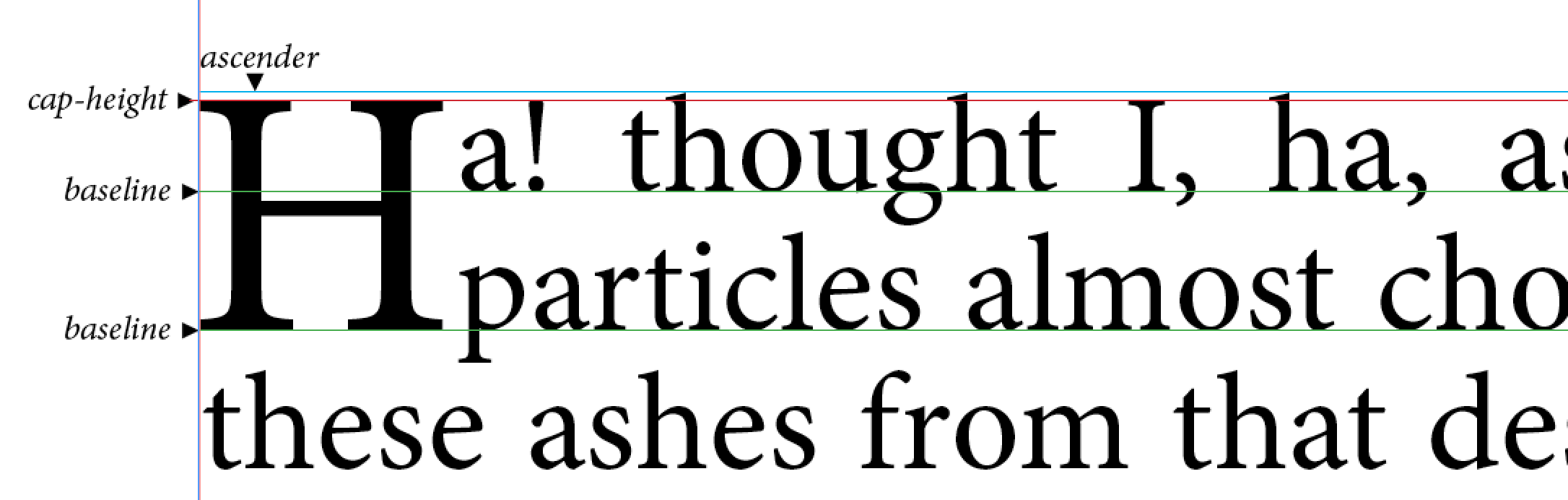
For best results, the initial letter should be aligned with the adjoining text:
 </img>
##When can I use it?
The initial-letter property is defined in the working draft of the CSS Inline Layout module. WebKit Nightly currently supports the feature.
For other browsers, dropcap.js exposes the same feature set as initial-letter.
##Where can I learn more?
- We have posted an article on our blog.
- Smashing Magazine reviews the history of drop caps as well as various CSS methods to set them.
- A tumblr of problematic CSS drop caps.
- dropcap.js, a JavaScript library for beautiful CSS drop caps.